Case study · GovTech · Web app · Maps · AI
Ghana Lands Commission
A Command Centre MVP for the Ghana Lands Commission. National leadership sees registration, case flow, revenue and land integrity on one map that drills from the country to a single parcel, and a regional Land Commissioner runs their office's workload from the same product. I designed it and turned it into a working MVP with Claude Code, directing the build rather than writing the code by hand.
At a glance
- The problem
- The Commission is digitising Ghana's land records, and its leaders needed one place to see coverage, case flow, revenue, fraud and physical files across 16 regions and 261 districts, while each regional office needed to run its own day.
- What I did
- Designed a working MVP and directed its build with Claude Code in two weeks, from layout explorations and a brand system to two complete workspaces, a drillable map, six reports and an AI assistant, with a detailed handoff for the team that follows.
- The result
- An MVP delivered to the client, with every screen working and every figure agreeing with every other, ready for demos and feedback.
Project timeline
- Three layout directions and the guidelinesWeek 1
- The map and six reportsWeeks 1–2
- The office's map and six screensWeek 2
- AI assistant and handoff notesWeek 2
The product.
The Ghana Lands Commission is digitising the country’s land register, from physical files to a governed digital record. The Command Centre is where that programme is watched and run: registration coverage, cases and how long they take, revenue and what leaks from it, fraud, the physical files themselves, and how far the data can be trusted.
The client’s requirements named two people, each with a different job.
Super Admin
National leadership. Looks at the whole country, finds where things are going wrong, and drills down to the district or parcel behind a number.
Land Commissioner
Runs a regional office. Opens on their own jurisdiction and manages the day: what came in, what is stuck, who has capacity and what waits for approval.
Designed in the browser.
I designed this one in the browser. I directed Claude Code to build the MVP in React and TypeScript, with Leaflet and Mapbox for the map, so every layout was tested against real geography, real data shapes and a real browser from the first day.
The data is mock, but it was generated to agree with itself. The same 16 regions and 261 districts give the same figures on the map, in every report and in the Commissioner’s office, so a number never says one thing in one place and another somewhere else.
Three ways to lay it out.
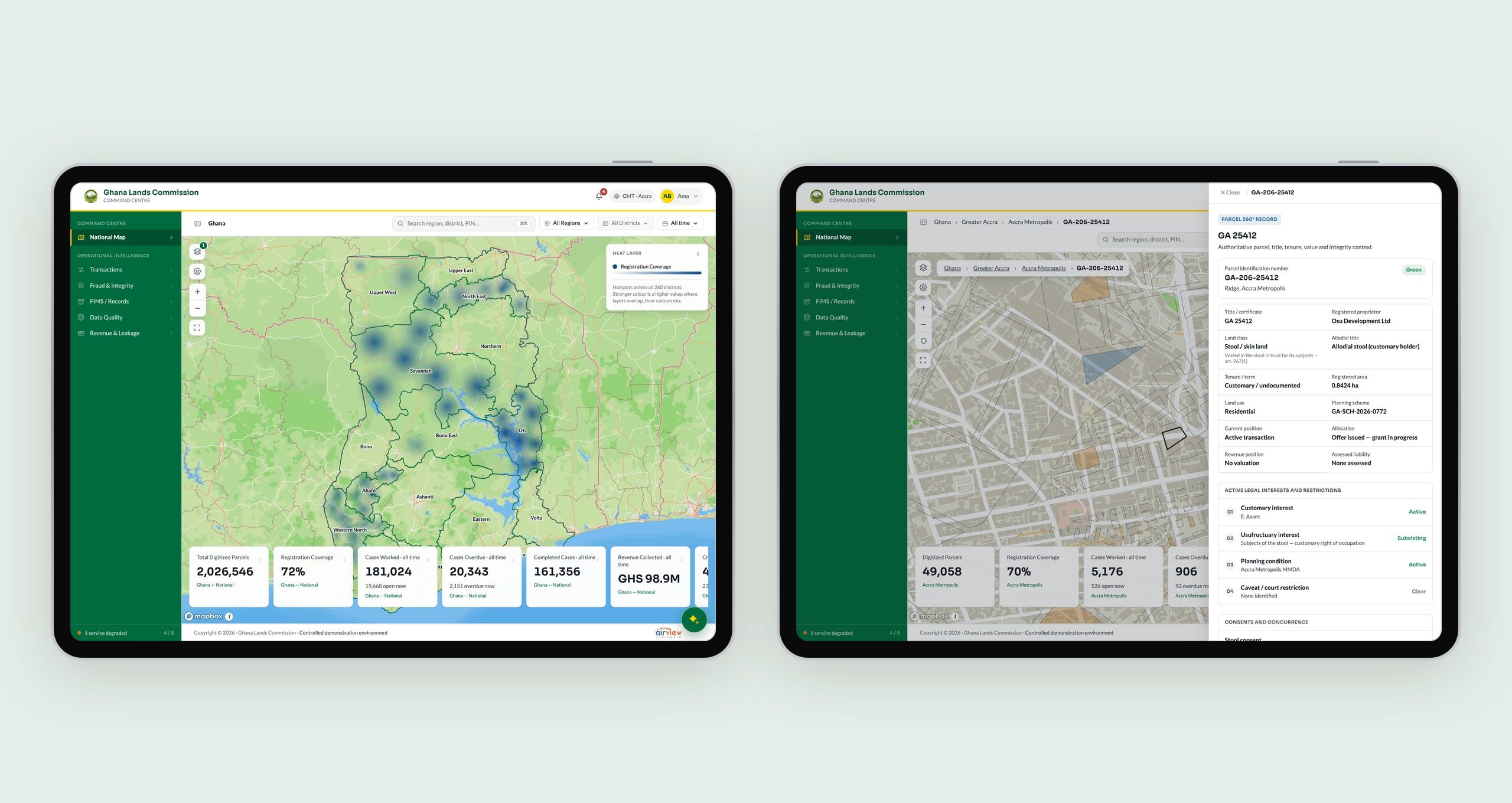
Before building, I explored three directions for the national view. Map first, with the figures condensed into a floating rail. A sidebar for navigation, to give the map more height. Or a strip of figures above the map.
The product combines the first two. A grouped sidebar holds the screens, the map fills the rest, and the figures float over its bottom edge, where they change with whatever the map is showing.
A front door, not a wall.
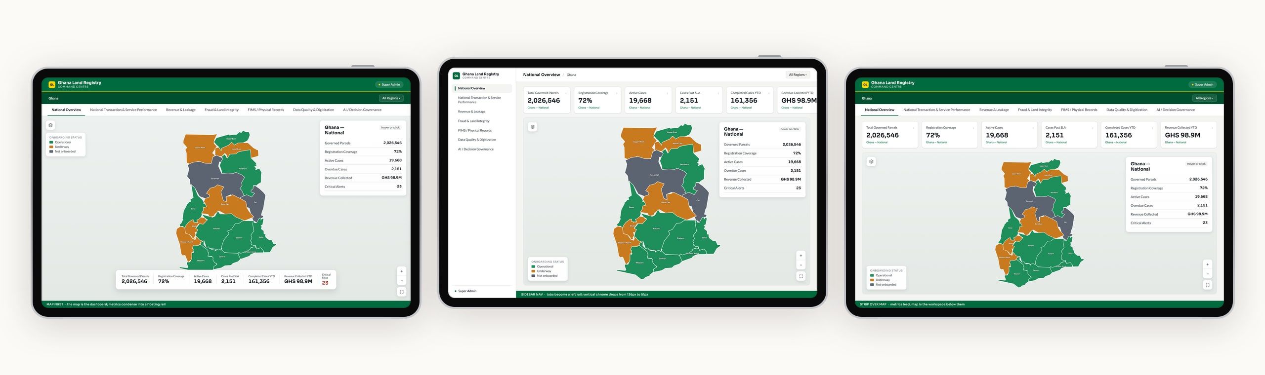
The app opens on a sign-in with the Commission’s own ID and password, laid out the way serious products do it: a quiet form on one side, and the institution on the other, with the Commission’s building and the scale of what it governs.
The map is the dashboard.
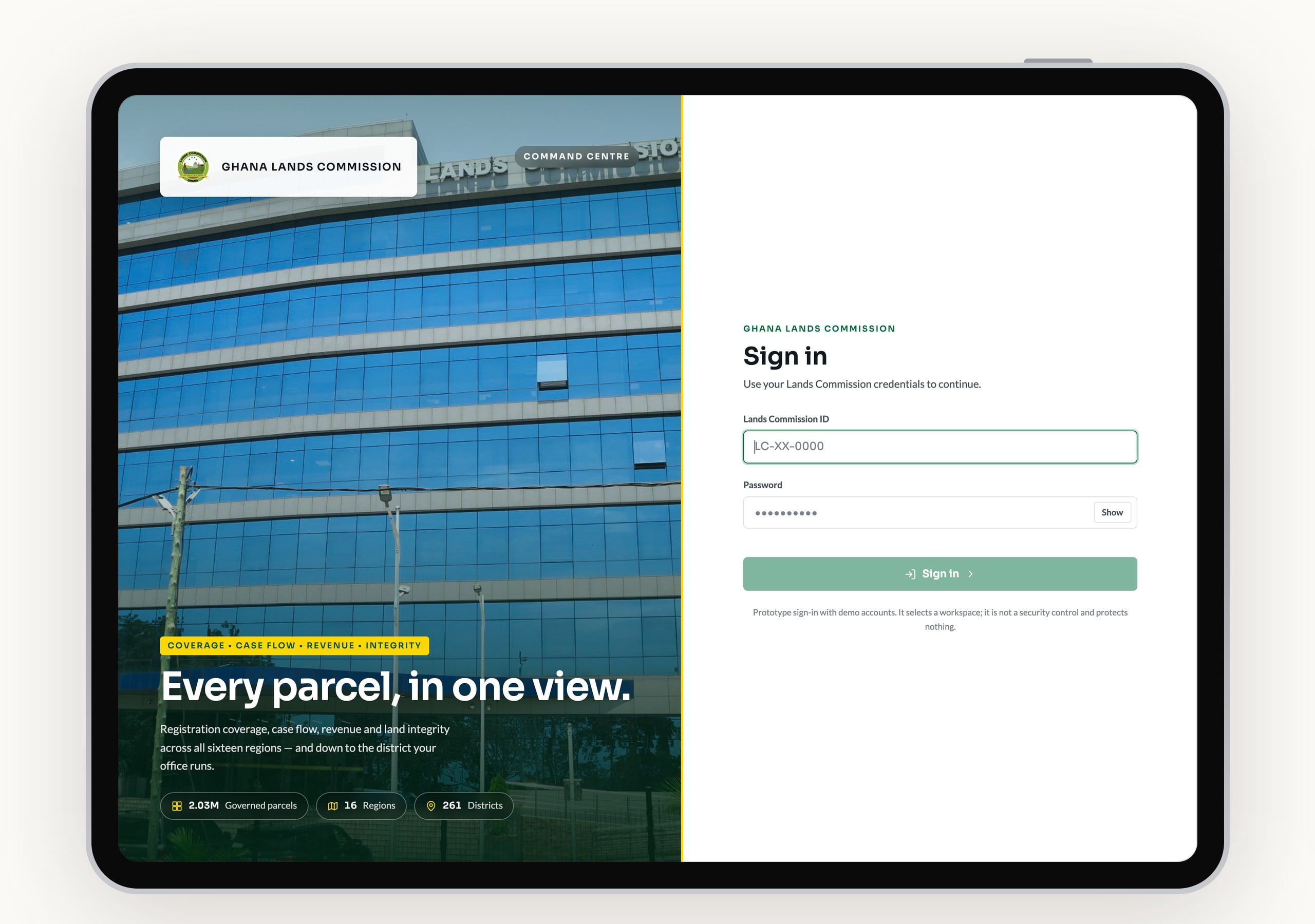
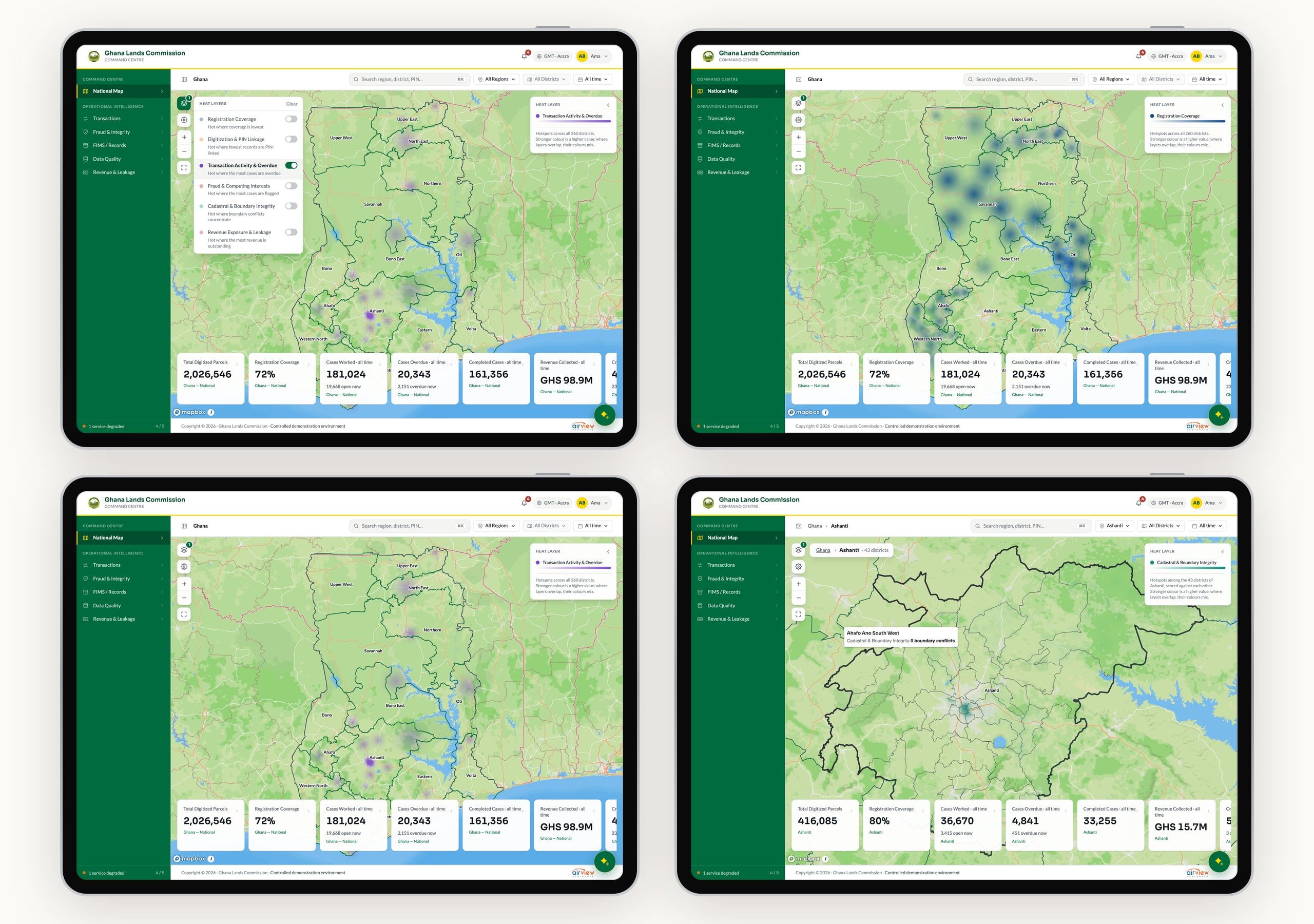
Leadership either looks at the country or looks at the numbers, so the map gets its own place at the top of the navigation. It drills from Ghana to a region, a district and a single parcel, and the figures along the bottom follow it all the way down.
A parcel opens its 360° record: title, tenure, land class, planning scheme, legal interests and restrictions. It’s the screen most likely to be mistaken for real data, so it says on its own face that every detail is illustrative.
Six ways to read the map.
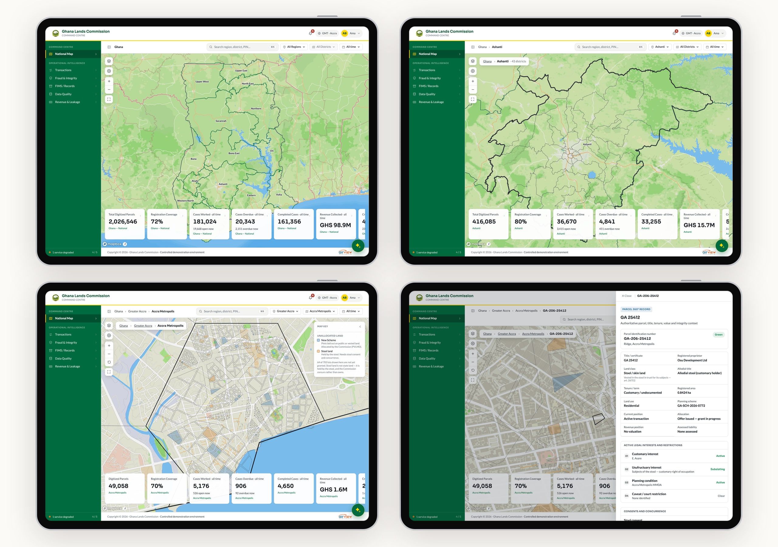
Six heat layers show where something needs attention: low registration coverage, records not yet linked to a parcel number, overdue cases, fraud and competing interests, boundary conflicts, and outstanding revenue. Each says what “hot” means in one line, and a small key explains the colour once a layer is on.
Every number can explain itself.
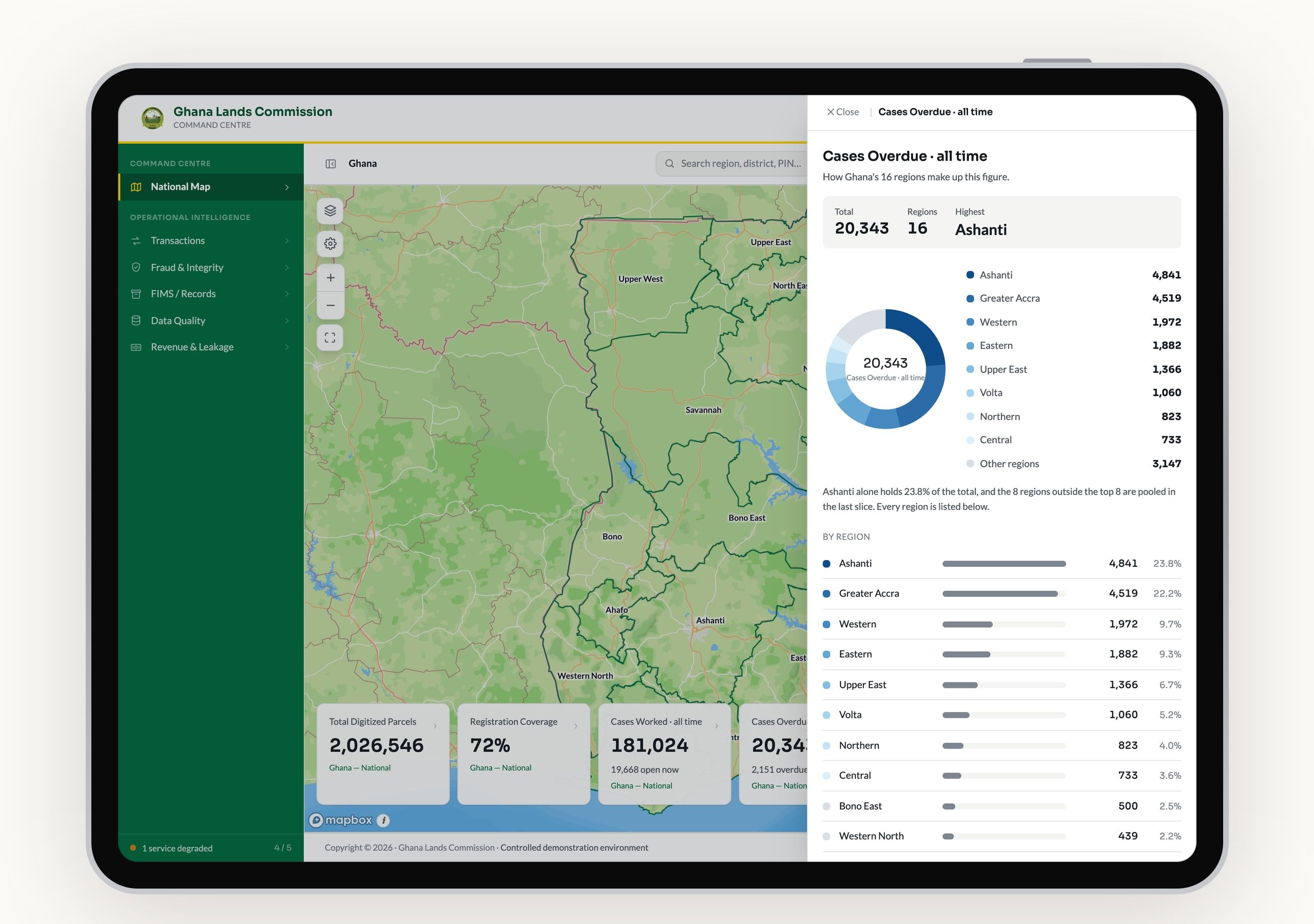
Clicking a figure on the map opens what it’s made of, one level down. Cases overdue nationally break down by region, with a chart for how concentrated they are and the full ranked list below.
Not every number gets a chart. A percentage isn’t a share of a total, so registration coverage shows a ranked comparison instead of a pie, and says why in one line.
Five reports, one structure.
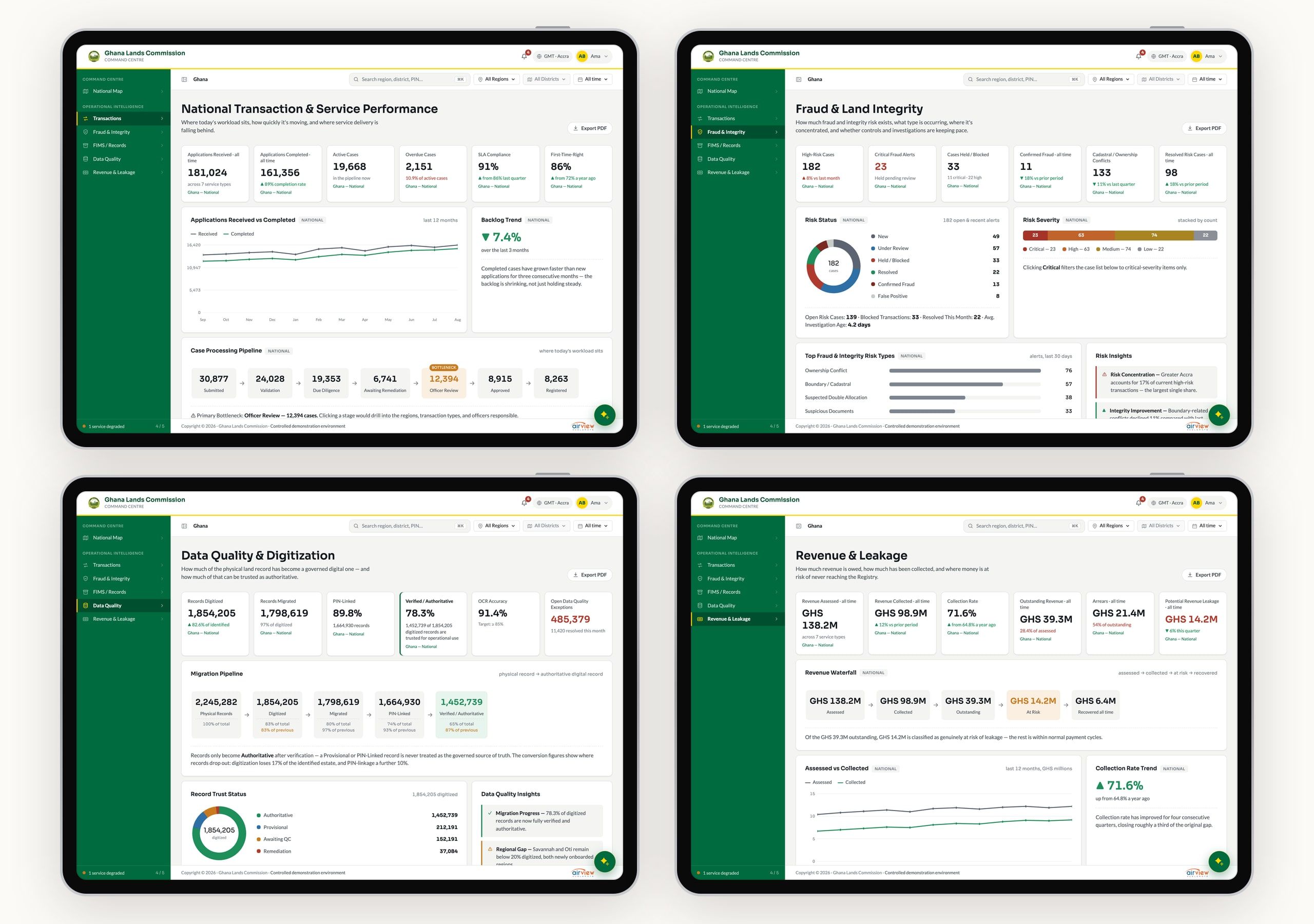
Behind the map sit five reports from the requirements: transactions and service performance, fraud and land integrity, physical records, data quality and digitisation, and revenue and leakage. Each starts with the same row of six headline figures, then the panels that explain them, on one shared grid so every edge lines up down the page.
Funnels show where things drop off, because in a migration or a revenue cycle the drop-off is the story. The workflow pipeline flags its own bottleneck, ranked by how long cases wait, not by how many there are.
The Commissioner's office.
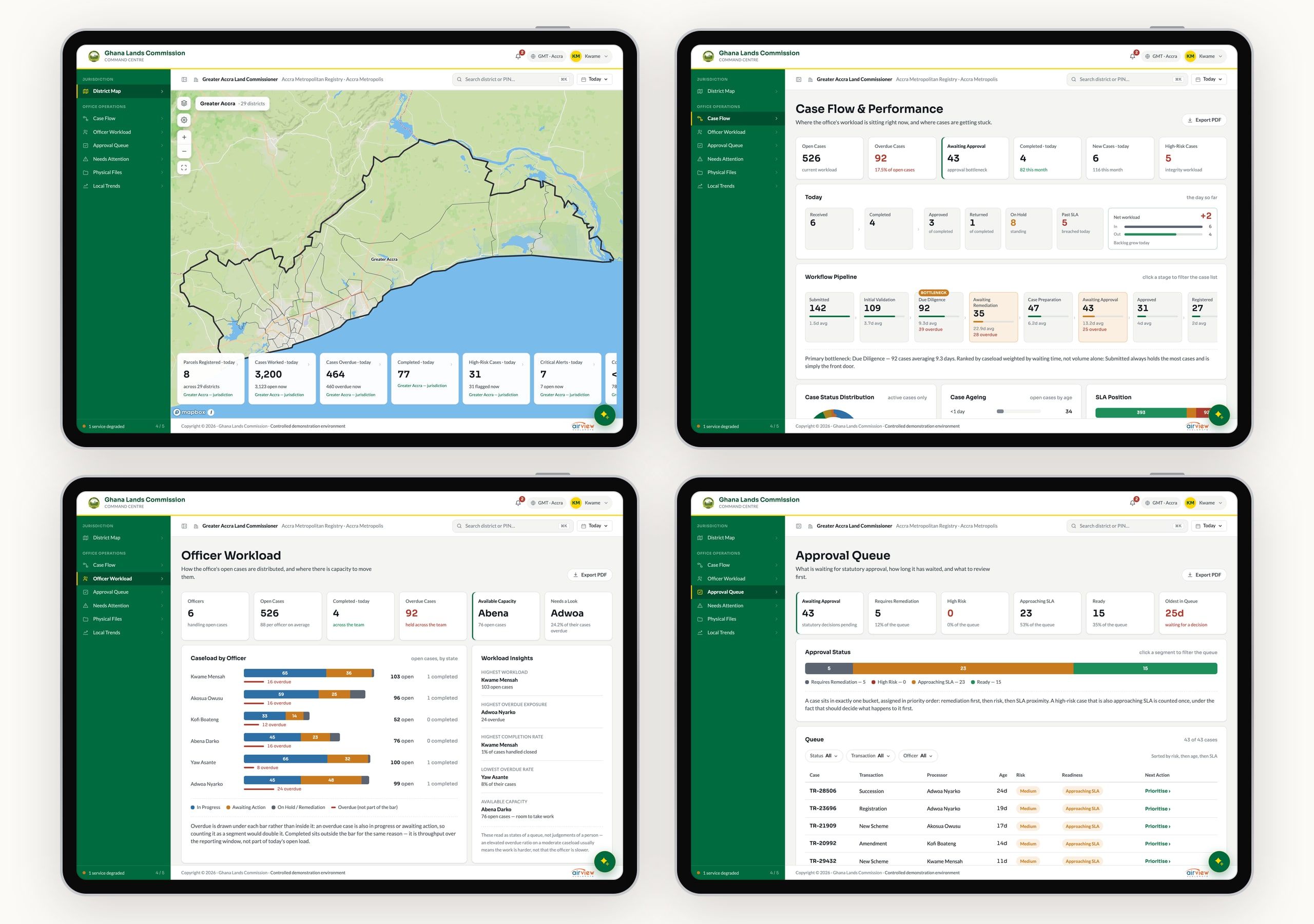
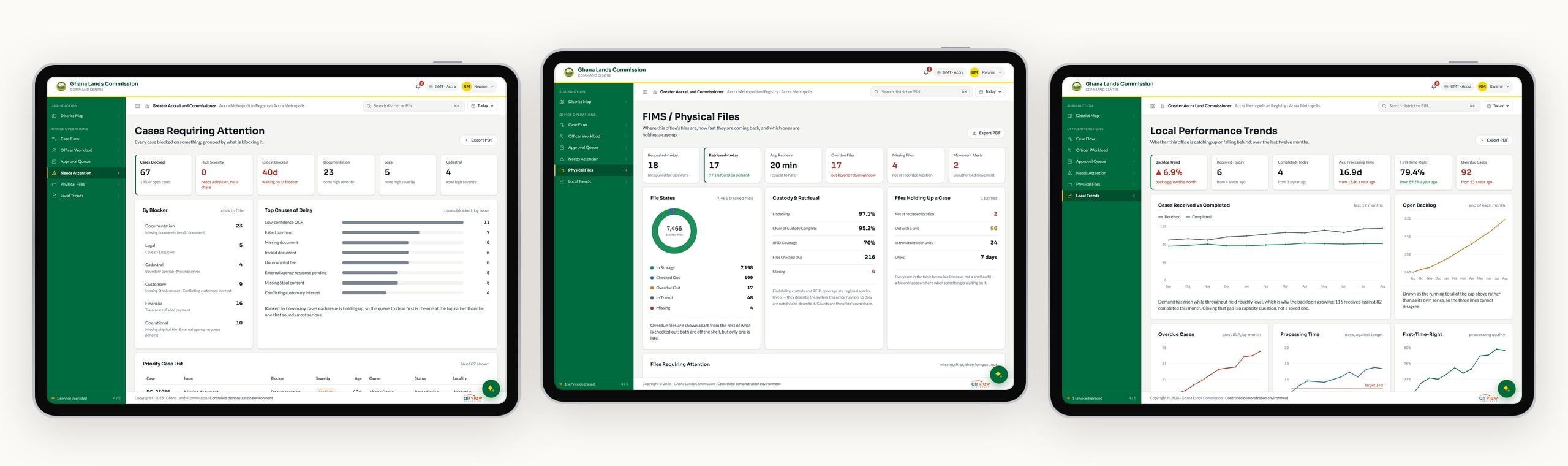
The second workspace is the same product, one level down. The Land Commissioner opens on their own region, on the same map, and their office’s figures reconcile exactly with the district the Super Admin sees.
Their screens are about running the day. Case flow and its bottleneck, each officer’s workload in the language of capacity rather than performance, and an approval queue where every case sits in one bucket, in the order that should decide what happens to it first.
What's stuck, and why.
Cases requiring attention are grouped by what blocks them, from documentation and legal caveats to boundary disputes, because a missing document is a phone call and a caveat stops a registration outright. Physical files show where each one is and which ones are holding up a case, and twelve months of trends show whether the office is catching up or falling behind.
Zala, the assistant.
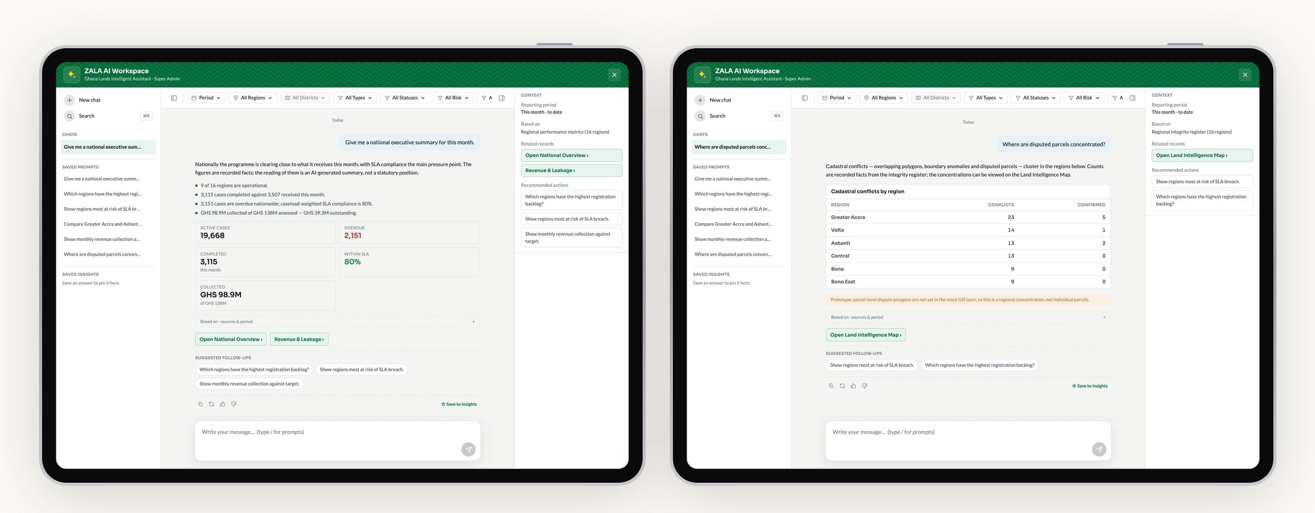
Zala answers questions about the whole programme in plain language, with the figures, the sources it used, links to the screens behind them and suggested follow-ups. It’s careful about what it is: the figures are recorded facts, and the reading of them is labelled as an AI-generated summary, not a statutory one.
A voice for a registry.
I wrote brand and interface guidelines alongside the product, because a misread colour here can mean an overdue case goes unnoticed. The voice comes down to four rules:
- Plain and specific. Lead with the number, not the adjective. “Overdue cases: 38, up 6% this month”, not “Overdue cases are rising”.
- Operational, not accusatory. Workload is something to balance, not a ranking. “Available capacity” and “Requires review”, never “Worst performing officer”.
- Every claim traces to a record. Insights, exceptions and AI answers always lead somewhere a person can check.
- Calm under pressure. Critical alerts get the strongest visual treatment, but the language stays level.
Colour and type.
The Ministry’s green and gold are kept for the product’s chrome, like the header, the navigation and primary buttons. Status has its own palette, deliberately a different green, so a healthy trend never disappears into the brand. Sora sets headings and every number, and Lato sets the rest.
Identity
- Ministry green#006B3F
- #00502F
- Ministry gold#FFD700
- Ink#14181F
- Paper#F4F5F3
Status
- Positive#1E8E5A
- Caution#C97A1E
- Critical#AF3B2E
Sora
Headings & figures
- Regular2,026,546 parcels
- Semi-bold2,026,546 parcels
- Bold2,026,546 parcels
Lato
Body & interface
- RegularEvery parcel, in one view
- BoldEvery parcel, in one view
Final notes
Turning the design into a working MVP with Claude Code changed what design meant on this project. Every decision met real data and a real browser the same day, so questions that usually wait for development came up while the design was still open. Should a percentage get a pie chart? What does "overdue" mean on a bar that also shows completed work? I wrote each answer into the handoff notes as I went, so the team that takes this forward inherits the reasoning, not just the screens. The hardest rule to keep was also the most important one. Every number had to agree with every other number, on every screen, because a command centre that contradicts itself is one nobody trusts.