Case study · GovTech concept · Mobile
Khadamaty
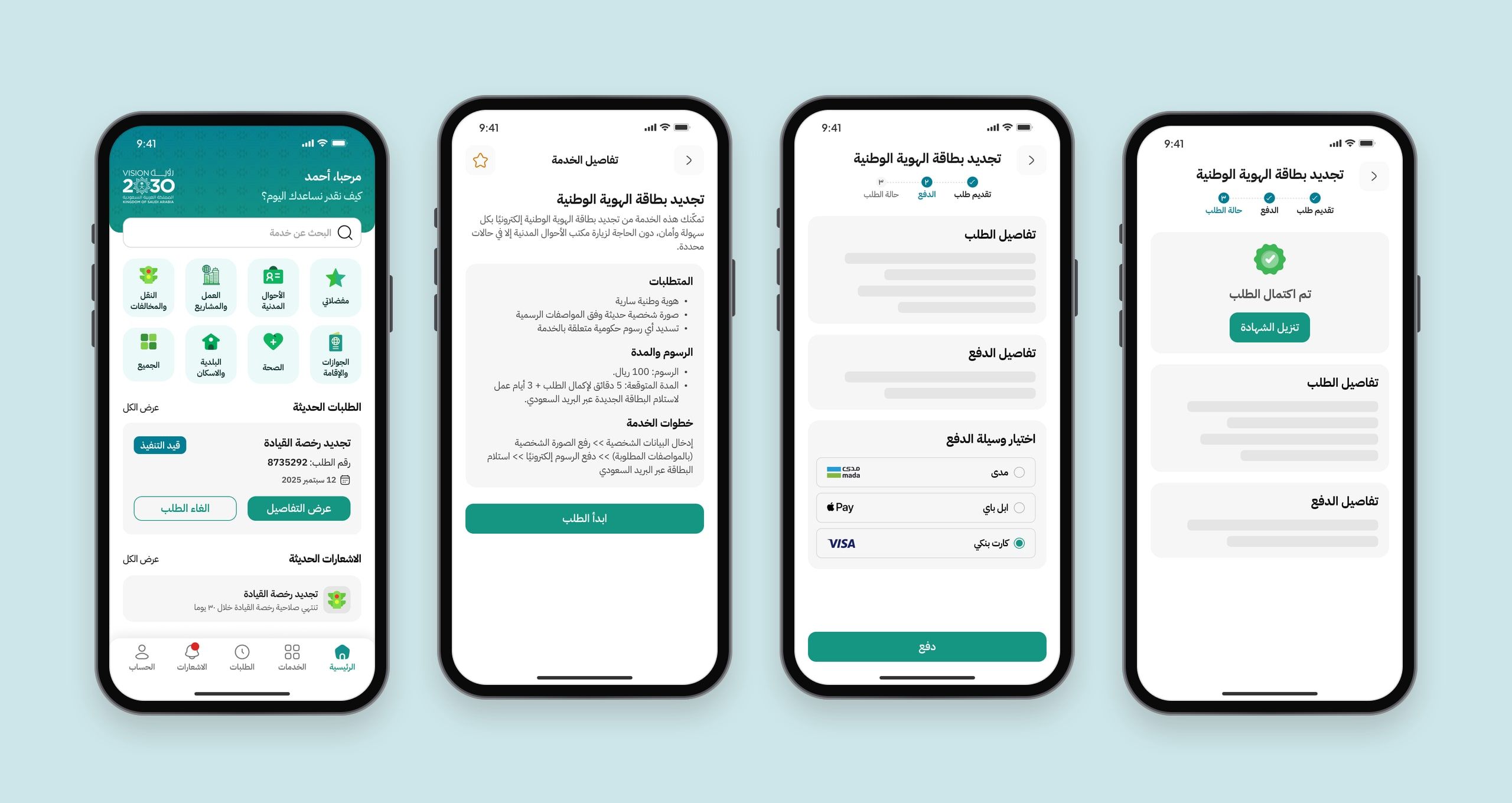
A concept app that brings scattered government services into one place. Sign in with your national ID, find a service across ten sectors, apply and pay in the app, then follow the request step by step until it arrives.
At a glance
- The problem
- Most platforms stop at “request received”, leaving people unsure where their request is or what happens next.
- What I did
- Mapped the national ID renewal journey end to end, then designed an Arabic-first app, design system and agency dashboard around the request lifecycle.
- The result
- A complete concept, from sign-in to payment and tracking, where a request’s status reaches the user instead of the user chasing it.
Project timeline
- Informal conversations and a review of existing platformsDay 1
- National ID renewal in seven stagesDay 2
- 30+ greyscale wireframesDays 3–4
- Final screens, components and statesDays 5–6
- A tool for staff to update request statusDay 7
The problem.
The real problem isn’t submitting a request. It’s knowing what happens after. Most platforms end at a “we’ve received your request” screen, and the user is left without a clear answer: where is my request, and what’s the next step?
Digital government services have improved a lot, but the everyday experience still runs into three recurring obstacles:
- One platform per agency. Each agency has its own platform, account and way of signing in. Getting three things done can mean three apps and three passwords.
- The gap after submitting. Once a request is sent, the information disappears. When will the documents be reviewed? Is payment due now or later? Why was it rejected?
- Crowded interfaces. Existing platforms hold so many services that finding the right one becomes a task in itself.
Design question: how might we make a government transaction easy to complete, and then let people know it’s on track without having to chase it?
What we learned.
Since this is a concept project, discovery took two light paths: informal conversations with Saudi users about their experience with existing platforms, and an exploratory review of those platforms, covering sign-in patterns, how services are organised, and how request status is shown.
- Trust is there, clarity isn’t. People trust official platforms, but don’t know where their request is after submitting it.
- Finding a service is harder than completing it. Too many services without clear categories make discovery exhausting.
- Payment is a moment of anxiety. Any ambiguity at the payment step weakens trust in the whole experience.
- Notifications are either missing or noisy. People want a notification when their request’s status changes, not a flood of general alerts.
These are qualitative notes from informal conversations, not systematic research with a representative sample. In a real production version, I’d validate them through structured interviews and usability testing.
One journey, end to end.
I picked a widely used service, renewing the national ID card, and mapped its full journey across seven stages, from discovering the service to receiving the new card. At each stage I noted what the user does, what they’re thinking, how they feel, and where there’s an opportunity to improve.
What the map changed in the design:
- The pain of tracking status and paying made the request lifecycle the heart of the product, not a secondary screen.
- A summary of requirements before starting became a screen showing requirements, fees and expected time before the request begins.
- More than one payment method, with an easy retry became a payment screen with three methods and a clear path when payment fails.

Ten sectors, five tabs.
I organised services into ten sectors covering different parts of a citizen’s life. Each sector has its own icon and colour, repeated across cards, filters and notifications, so people learn the app’s structure quickly.
Navigation is five fixed tabs: Home, Services, Requests, Notifications and Account. I gave Requests the same weight as the others, not a sub-page, because following a request is a core part of the app.


Structure first, then visuals.
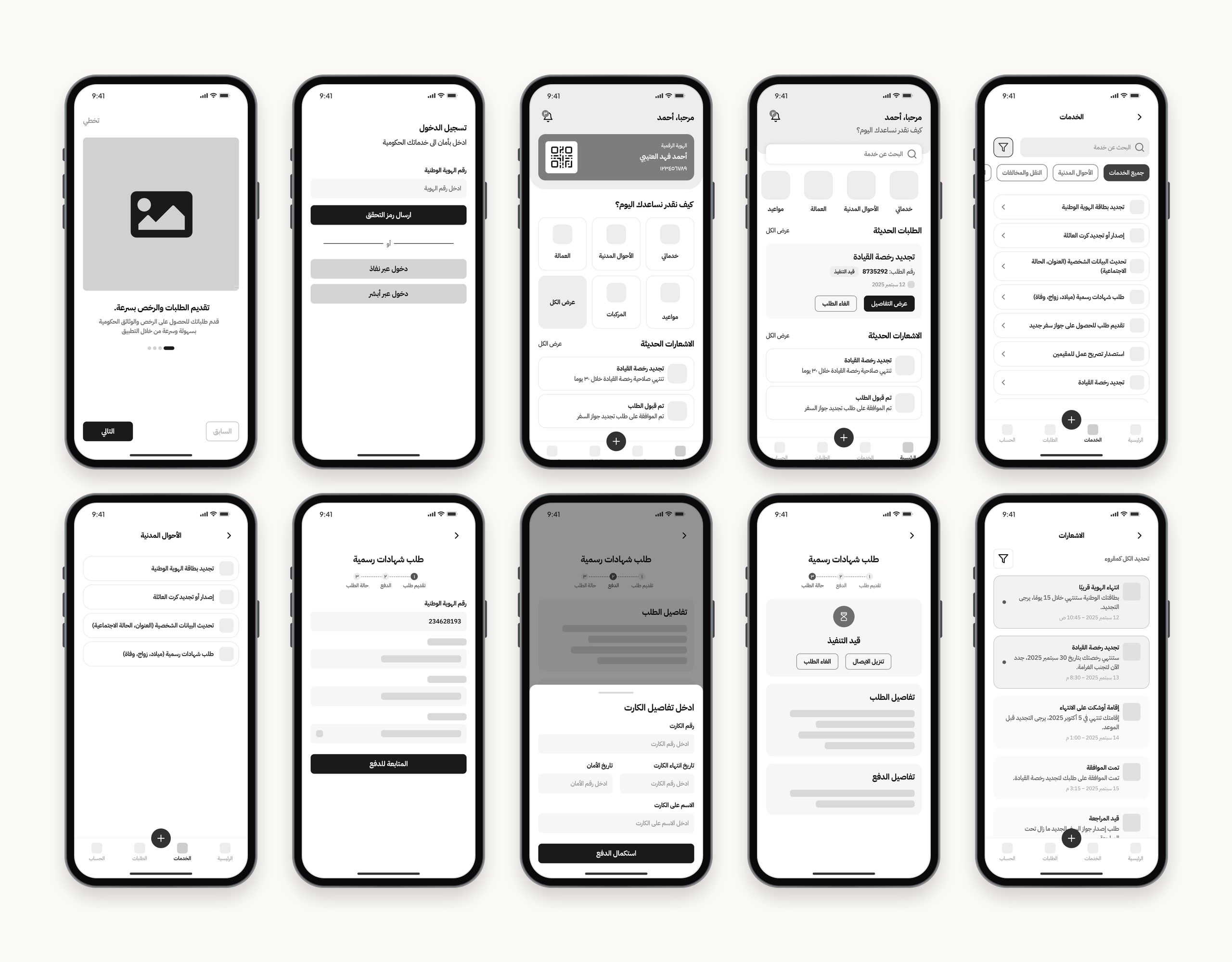
I started with more than thirty greyscale wireframes to test the structure before making any visual decisions: the order of fields, where the fee summary sits, and the sequence of payment screens. Changing these was cheaper at this stage, so I reworked the request flow several times before reaching the final interface.
Five states, no one left guessing.
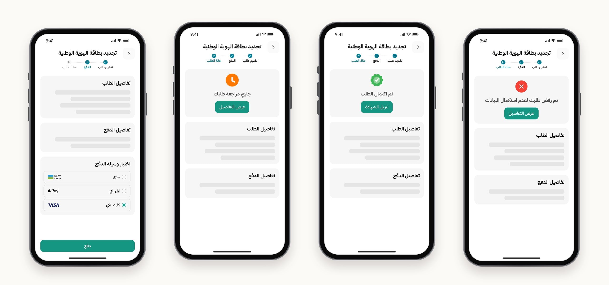
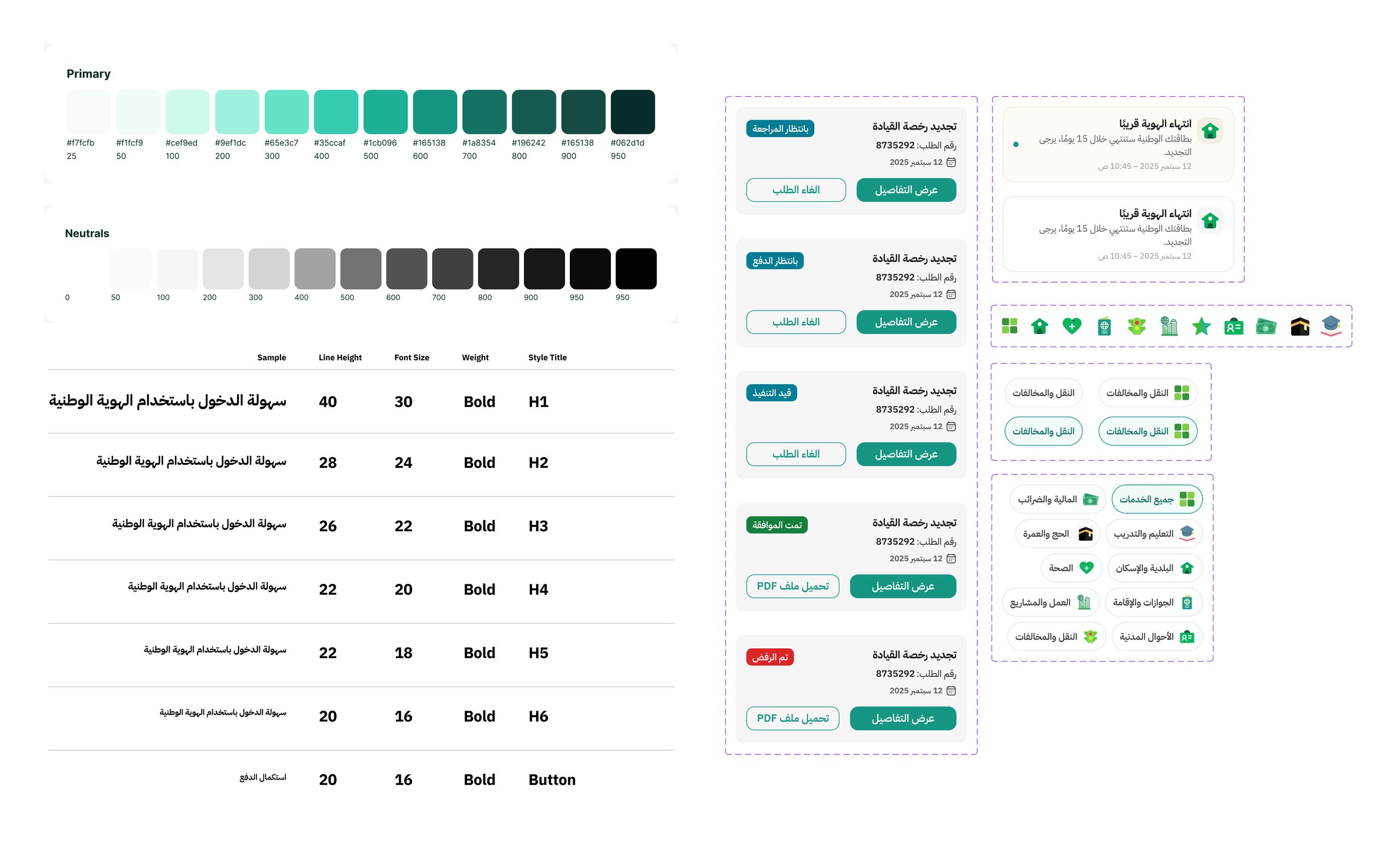
Every request moves through a clear cycle, and each state has its own colour, badge and main action: “Complete payment” while payment is pending, “Download file” once approved, and “View details” otherwise. At a glance, people know where their request is and what’s next, without opening it.
Payment is the most sensitive moment in the experience, so every transaction ends on a clear result screen: success with the request number, failure with a clear reason and a “Try again” button, or processing with an explanation of what to expect. No one is left staring at an ambiguous loading screen.
Request status isn’t something people should have to look for. It should reach them at the right time.
Notifications that mean something.
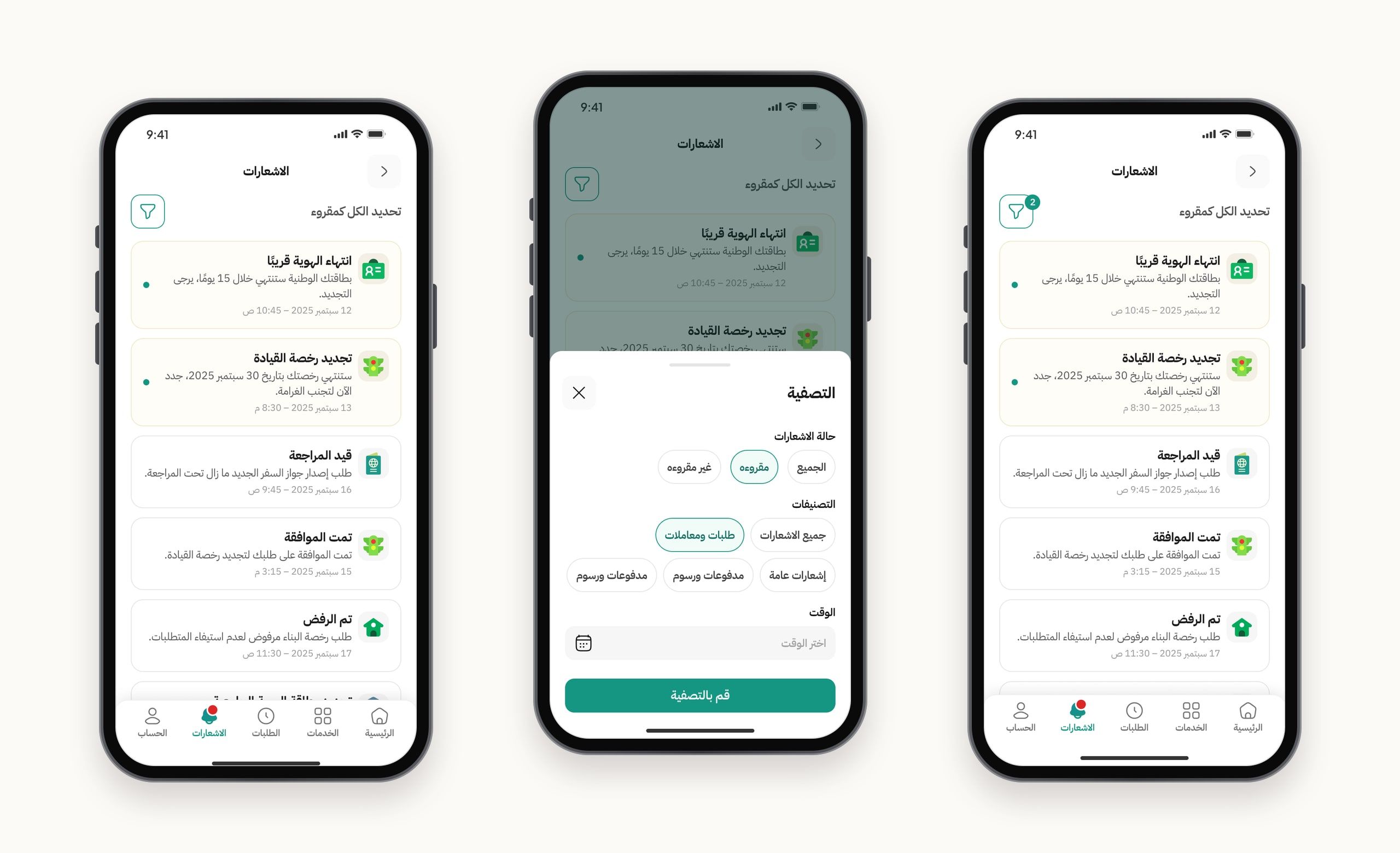
Notifications are grouped by sector, with unread ones clearly highlighted, and can be filtered by read status, category and time.
A system to build on, not just pretty screens.
The principle behind the system: every state a user can pass through has a component designed for it in advance, so states never have to be invented on the spot. The system includes a green scale from 25 to 950, a full neutral scale, semantic colours, and a type scale tuned for Arabic.
Arabic first, not translated later.
- Right to left from the first frame. I built the design right to left from the very first wireframe, from reading direction to the placement of icons and arrows, field alignment and badges.
- Eastern Arabic numerals in official contexts. Request numbers, amounts and dates use Eastern Arabic numerals, consistent with the interface language.
- A type scale for Arabic. Line heights and font sizes are tuned to Arabic letterforms and their extenders, instead of being carried over from a Latin scale.
- One term everywhere. The same phrase, “Awaiting review”, appears on the card, the badge, the notification and the agency dashboard, so people never have to interpret different wording.
The experience doesn’t end with one side.
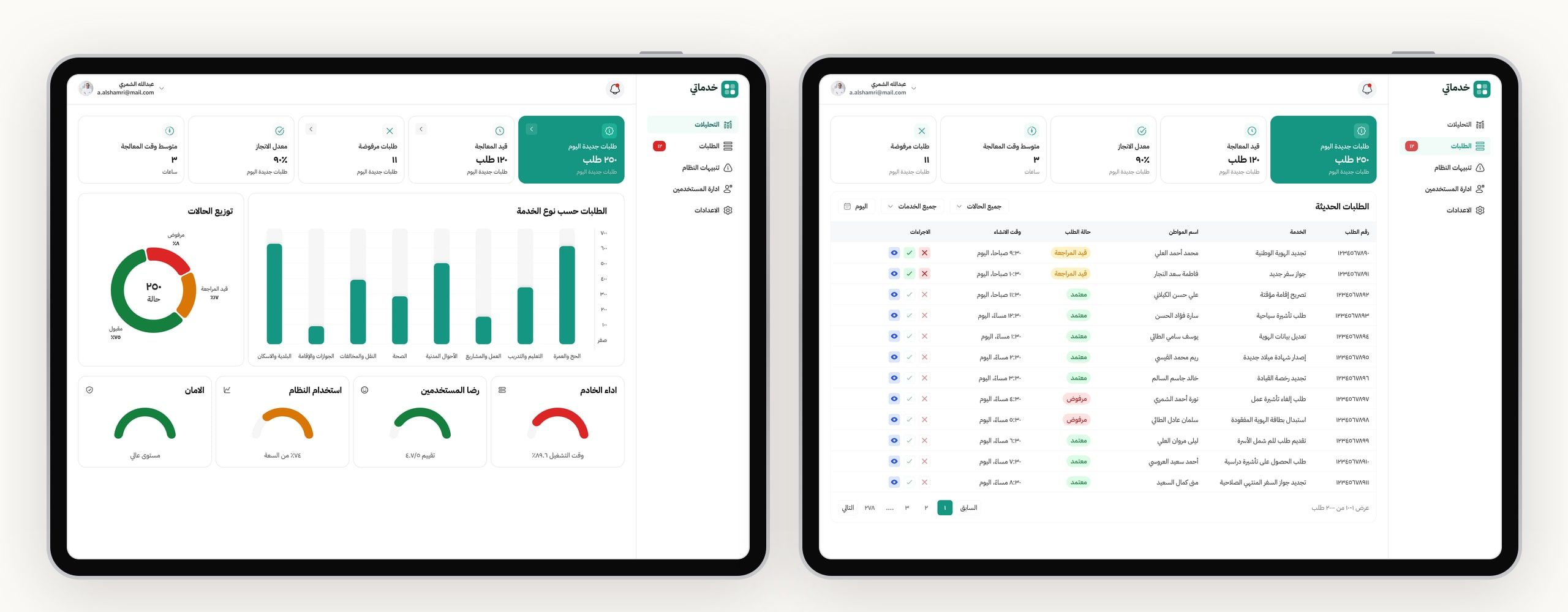
The promise of up-to-date request tracking only works if agency staff have an easy tool to update statuses. The dashboard shows how requests are distributed across statuses and services, alongside operational indicators and a requests table with actions right in the row: view, approve or reject.
The numbers shown in the dashboard design illustrate the concept. They aren’t real measurements.
If it became a real product.
- Run structured usability tests on the “submit and pay” flow, to measure completion without help.
- Run a full accessibility audit, covering colour contrast, touch targets and Arabic screen reader support.
- Design the edge cases, such as losing connection during payment, the verification session timing out, and requests left pending for a long time.
- Build an English, left-to-right version on the same system.
Final notes
Designing the request lifecycle before the screens gave every screen a clear job in a bigger story. Building complete component states up front cost time early, but saved much more later. And for all their simplicity, the informal conversations shaped the most important decision in the product, that following up isn’t a side feature but the core of the experience.