Case study · FinTech · Mobile · Arabic
Flank
A redesign of Flank, a Saudi app for comparing financing offers from different banks. Individuals and companies request financing, compare offers and talk to a bank advisor, and bank staff answer requests from their own side of the app.
At a glance
- The problem
- The existing app had gaps in its flows, from missing pages and unclear navigation to inconsistent colours and icons, across three very different kinds of user.
- What I did
- Audited the existing app screen by screen, then redesigned it end to end for individuals, companies and bank staff, with a design system and a new brand identity.
- The result
- A complete redesign now in development, with clearer onboarding, a single flow to compare offers and talk to an advisor, and a dedicated workspace for bank staff.
Project timeline
- Every flow of the existing app reviewed and annotatedWeek 1
- A new logo, app icon and coloursWeek 2
- Individuals, companies and bank staffWeeks 2–4
- Components and type for handoffWeek 4
The product.
Flank is a Saudi platform for comparing financing, under the regulatory sandbox of the Saudi Central Bank (SAMA). Instead of visiting bank after bank, people request financing once and compare the offers that come back.
It serves three kinds of user, each with a different side of the same product.
Individuals
Compare offers for mortgages, personal finance, leasing and credit cards, and talk to a bank advisor.
Companies
Request business financing and compare what banks offer the company, with the same flow.
Bank staff
Receive requests, send offers, chat with customers, and track their own performance and ratings.
Starting from what was there.
The app already existed, so I started with an audit. I went through every flow, from landing and registration to services, offers and the staff pages, and noted what was missing or getting in the way.
What the audit found.
Grouped by flow, the notes pointed to the same few problems:
- Missing pages. There was no request and chat history, no customer profile, no account management, and no way to set or reset a password.
- Navigation that got in the way. The app needed back buttons in the right places and a bottom tab bar, and onboarding needed next and previous buttons, plus tapping left or right.
- Staff left out. The employee registration flow needed work, staff had no page for performance and analytics, and there was no page to add a new offer.
- An inconsistent look. Colours needed adjusting for consistency and accessibility, and icons needed to match each other and the brand.
A brand built from a missing piece.
Flank’s logo is built on an incomplete square at the top of the F. The dark blue squares stand for the existing financial system, banks and institutions, and the lighter blue piece completes the picture, as the company does between customers and the right financing. I carried the same idea into the app icon.


A system in Arabic first.
The app is designed in Arabic, right to left, with Cairo for every type size. A deep navy carries headings and buttons, light blues hold cards and highlights, and green and red mark statuses.
Brand
- Navy#193260
- #1D2658
- Blue#29ABE2
- #CADAF3
- #EFF5FF
- #F4F6F8
Status
- Success#0BAC73
- Error#FF2020
Cairo
Typeface
- Regularمنصتك الذكية لمقارنة التمويل
- Semi-boldمنصتك الذكية لمقارنة التمويل
- Boldمنصتك الذكية لمقارنة التمويل
A clearer way in.
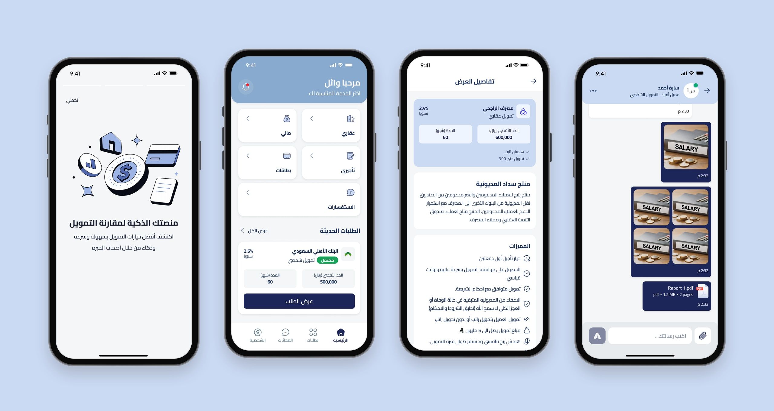
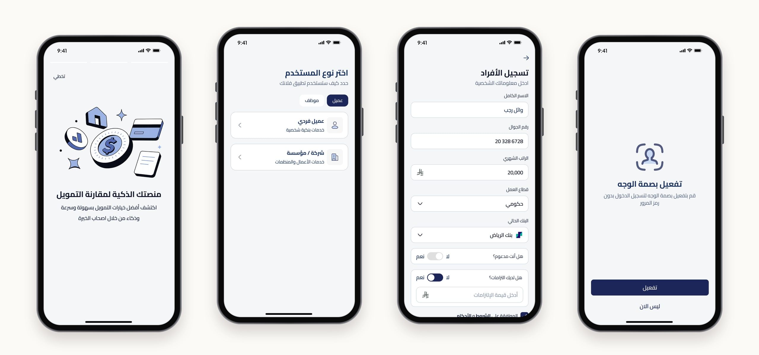
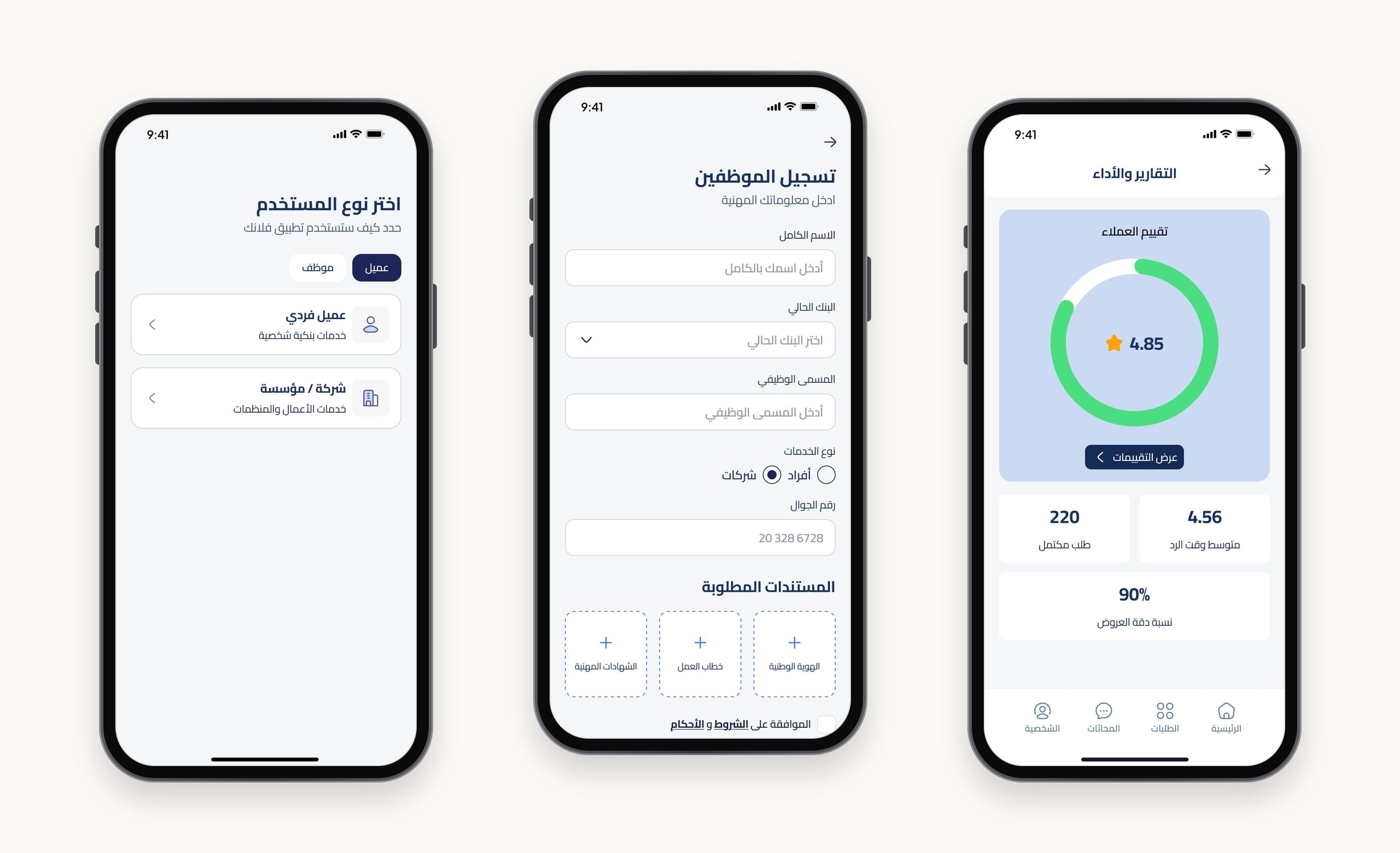
Onboarding explains what Flank does in a few short screens. People then choose whether they’re an individual, a company or bank staff, register with the details banks need, confirm their phone number, and can turn on Face ID instead of a passcode.
Request once, compare every offer.
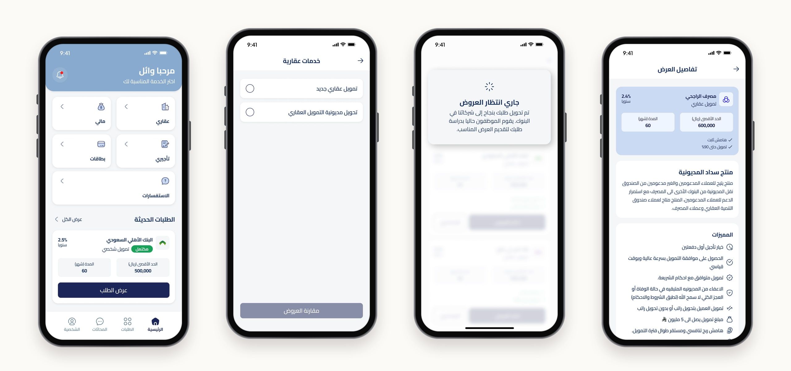
From the home screen, people pick a service, such as a new mortgage or moving an existing one, and request offers. Banks’ employees review the request, and the offers come back side by side, with the rate, term, amount and benefits of each.
A real person behind every offer.
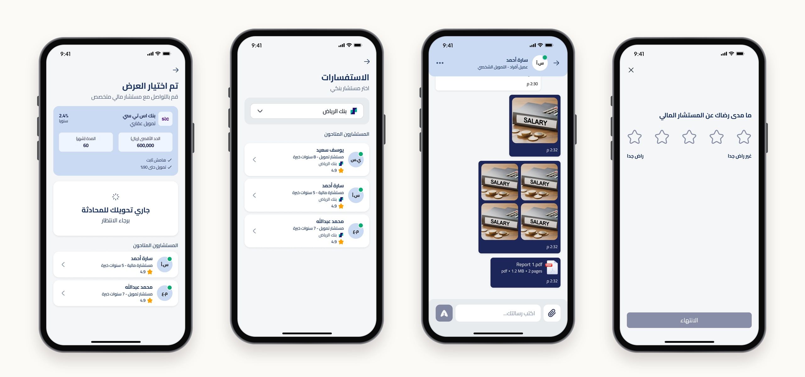
Choosing an offer connects people to a financial advisor at that bank, or they can pick an advisor themselves to ask questions first. The chat supports documents, and a short rating at the end tells the bank how it went.
Cards, compared the same way.
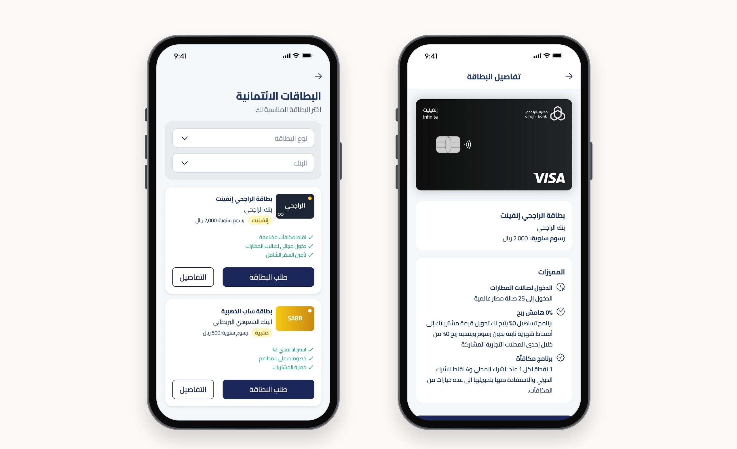
Credit cards follow the same pattern: filter by card type and bank, compare annual fees and benefits, and request a card or read its full details.
The bank's side of the app.
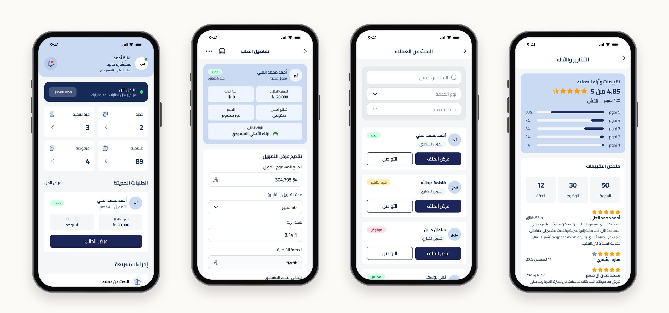
Bank staff get their own workspace. A dashboard shows new, in-progress, completed and rejected requests, each request opens with the customer’s details and a form to send an offer, and staff can search customers by service and status and see how customers rate them.
Staff, set up properly.
The audit found the staff registration flow needed the most work. Staff now register with their professional details, the services they handle and the documents the bank needs, and a performance page answers the missing analytics.
Final notes
Starting with an audit of the existing app, instead of a blank canvas, kept the redesign grounded. Every change answered a gap I could point to, from a missing profile page to a back button in the wrong place. Designing three sides of one product at once, individuals, companies and bank staff, also meant every request had to make sense from both ends, the customer asking and the employee answering.